In-Depth Guide
The Complete Guide to UI/UX Design
Our team has written a comprehensive guide covering technical specs, best practices, and the exact approaches we use on every project.
An exceptionally appealing website can still have poor conversion rates. We’ve witnessed it on countless occasions: a homepage that looks absolutely beautiful when you first look at it, yet the site has an unexpectedly high bounce rate that completely surprises the client coming into the project.
We’ve witnessed it on countless occasions: a homepage that looks absolutely beautiful when you first look at it, yet the site has an unexpectedly high bounce rate that completely surprises the client coming intgo, project.
The difference between a website’s visual appearance and how it truly performs is what UX design work is meant to close. The web design service covers the build itself, the visual output a visitor sees and clicks through. This web page talks about what happened before that: the research and testing work that decides where every button, form and headline actually goes, and why.
What UI UX Design Actually Means for a UK Business
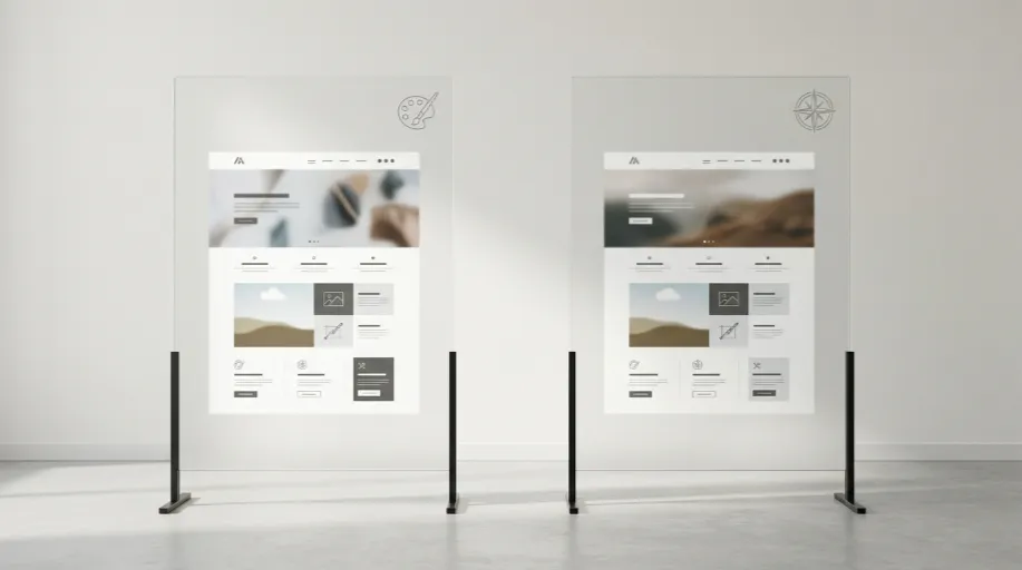
UI design includes color, buttons, typography, spacing, and visual layers. The thinking behind UX design is the substance of who a user is and how they move through a site. If you get UI correct without UX, you might get a pretty thing but lose people at checkout.
The two collaborate in commercial sites to lessen the friction between someone landing on a page and them completing an action, whether that be a purchase, an enquiry form, or a call.
Where Conversion Actually Gets Lost
In our audits of existing UK client sites before a redesign, the same handful of problems show up repeatedly.
- Checkout or enquiry forms asking for far more information than necessary
- Navigation menus built around internal company structure rather than how visitors actually think
- Call to action buttons that blend into the background instead of standing out
- Mobile layouts treated as an afterthought rather than designed from the start
That third one sounds minor until you see the numbers behind it. A client came to us with a call to action buried below three sections of text on mobile, and simply moving it above the fold and changing its colour lifted click through on that button noticeably within the first month of the change going live.
Our Research and Testing Process
Prioritize User Research.
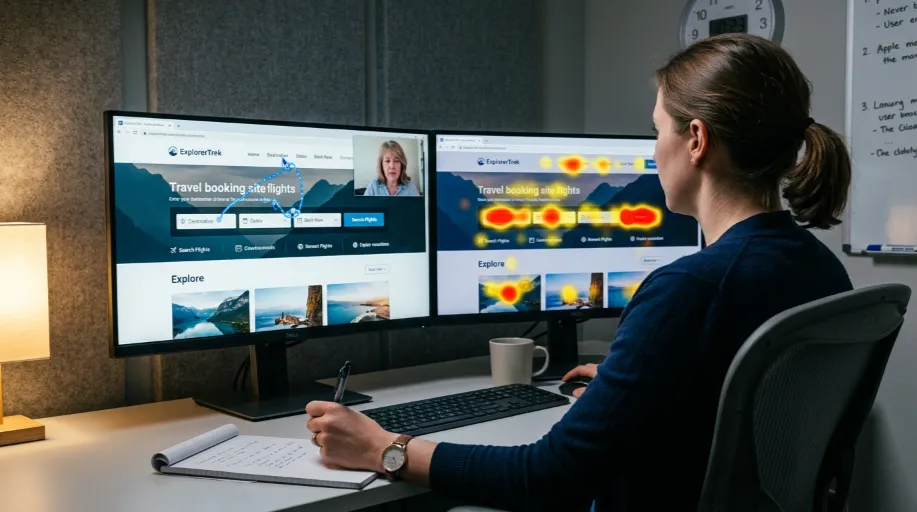
Before we create any wireframe, we analyze behaviour data, heatmaps, session recordings, and drop offs in Google Analytics. Many underperforming sites originally became that way because of guesswork over what their users wanted.
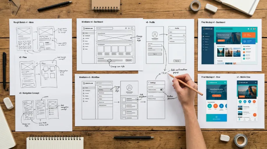
Visualizing User Journey Through Wireframe.
A visitor’s real journey is used to create wireframes rather than what looks good in a design mock-up. The Scene Is Purposefully Mundane. Cartons and Spools. It’s all looking pretty ugly. Changes are less expensive now than after the entire graphic design is finished.
Testing the Usability Before Launch.
Prototypes are clicked through by real people, not our internal team, before going live. We observe their hesitation, misclicks, and ultimate abandonment of the game. Stage two identifies problems that look fine on paper but fail when someone interacts with them.
UX Design vs Full Web Design: How These Two Services Differ
Businesses often assume these are the same service. They’re related, but the focus is different.
| Aspect | UX and Conversion Design | Full Web Design |
|---|---|---|
| Main focus | User behaviour, research, testing | Visual build, branding, layout |
| Typical starting point | Existing site with a performance problem | New site or full rebuild |
| Core deliverable | Wireframes, tested user flows, CRO recommendations | Finished, live website |
| Best suited to | Sites with traffic but weak conversion | Businesses without a site yet, or needing a full rebuild |
If your site already gets visitors but struggles to convert them, this service is usually the right starting point. If you’re building from nothing, web design is where that conversation should begin, with UX principles built into the process from day one rather than bolted on afterwards.
Applying This to WordPress Builds
A lot of the sites we do this work on run on WordPress, and the platform choice genuinely affects what’s possible. Page builder bloat, for instance, can quietly work against good UX by slowing load times regardless of how clean the design looks. Our WordPress development team gets involved early on projects like this, because a wireframe that assumes fast load times and smooth interactions needs a build that can actually deliver them.
Try Our Conversion Friction Checker
Envision a brief interactive tool where you respond to a small number of questions about your existing site. These might focus on length of form, number of steps to checkout and structure of mobile menu and it flags the two or three most likely culprits causing drop-off from your site. It provides business owners with a rough diagnosis before committing to a full UX audit, and it gives us a clearer starting point for that first conversation.
What Good UX Work Actually Costs a Business That Skips It
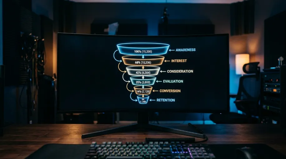
Every week a form stays too long, or a call to action stays buried, is traffic that arrived and left without converting. Paid traffic especially. Spending on ads to drive visitors to a page that loses half of them at the first form field is money that could have gone much further if the underlying UX had been fixed first.
We’d rather have that conversation honestly at the start of a project than have a client discover it eighteen months in, once a full year of traffic has passed through a site that was never quite set up to hold onto it.