
In-Depth Guide
The Complete Guide to Charity Marketing
Our team has written a comprehensive guide covering technical specs, best practices, and the exact approaches we use on every project.
Someone lands on a charity website having already decided, in their head, to give something. That decision took seconds. What happens on the next screen decides whether it actually turns into a donation or quietly evaporates.
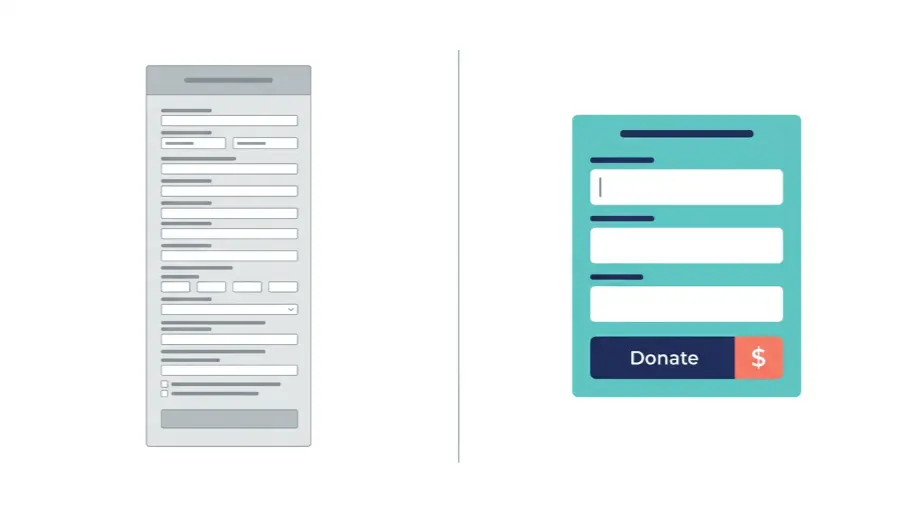
We’ve watched this happen too many times reviewing charity sites. Genuine goodwill, real intent to help, met with a donation form that asks for eleven fields before it even mentions Gift Aid. The visitor doesn’t leave because they stopped caring. They leave because the site made giving harder than it needed to be.
Charity Website Conversion: The Direct Answer
Here’s what matters most before rebuilding or improving a charity website.
| Question | Answer |
|---|---|
| What causes most donation abandonment | Long forms, unclear Gift Aid explanation, or a payment page that feels untrustworthy |
| Is Google Ad Grants worth setting up | Yes, eligible charities receive genuine free advertising spend, but most never claim it properly |
| Do donor and service searches need different content | Yes, someone looking to give and someone looking for support have different intent entirely |
| Should impact be shown, not just claimed | Yes, donors give more readily when they can see concrete outcomes, not vague statements |
| How quickly should a donation form load | Immediately, since slow-loading pages lose impulsive donors within seconds |
| Does a charity site need the same security as a business site | Yes, arguably more, since it handles payment details and personal donor information |
That first row is worth sitting with. Every extra field on a donation form is a small opportunity for someone to reconsider, and reconsidering rarely ends in a completed gift.
Why a Charity Website Needs the Same Design Discipline as Any Commercial Site
There’s a quiet assumption in the charity sector that a website just needs to exist, that the cause itself will carry the conversion. It doesn’t work that way. A visitor deciding whether to trust a charity with their card details is going through the same psychological process as someone deciding whether to trust an online shop, checking for professionalism, clarity, and a sense that someone competent built this.
Our broader Web Design Agency UK work applies this principle across every sector we build for, treating design as something that earns trust deliberately rather than decorative work sitting on top of content. For a charity, that discipline matters more than almost anywhere else, since the site’s entire point is converting sentiment into action within a single visit.
The Donation Page Deserves Its Own Focused Attention
A charity’s donation page is functionally identical to a landing page in the commercial world, a single focused destination built to achieve one specific outcome with minimal distraction. Too many charity donation pages instead sit buried within a general website template, competing for attention against navigation menus, unrelated content blocks and generic stock imagery.
We’ve seen genuine improvement simply from treating the donation page as its own dedicated destination, stripped of distraction, built around one clear action. Our Landing Page Design work follows exactly this principle for paid campaign traffic, and the same logic applies directly to a donation appeal, particularly one being promoted through email, social media, or paid advertising where every visitor arriving has already shown intent that deserves a focused page in return.
The Two Things That Move the Needle Most on a Donation Page
Getting this right means stripping away everything that isn’t earning its place on the page.
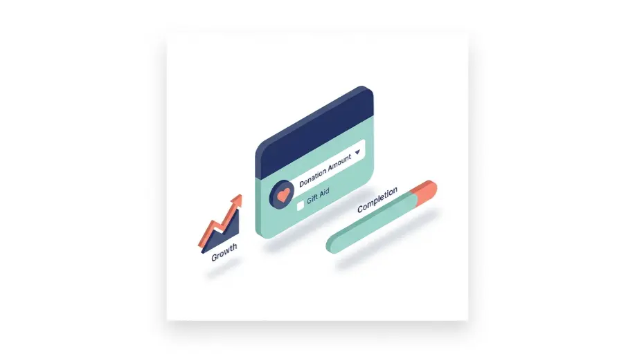
- A single clear donation amount selector, with suggested amounts shown alongside a custom option, rather than an empty field asking someone to guess what’s appropriate
- Gift Aid explained in one clear sentence, placed exactly where the decision happens, not buried in a separate policy page nobody reads before donating
Two things, done properly, tend to move the needle more than a dozen smaller tweaks scattered across a page that was never focused to begin with.
Trust Breaks Down Fast Once Something Feels Wrong
Charity websites handle something particularly sensitive, personal donor information and payment details from people who are, by definition, trying to do something good. A compromised or poorly maintained site undermines that trust in a way that’s genuinely difficult to recover from once a donor notices something feels off.
We’ve reviewed charity sites running on years old, unpatched software, quietly vulnerable to exactly the kind of compromise that ends up injecting spam content or, in worse cases, actually intercepting payment information. Our Website Malware Removal service exists for situations exactly like this, cleaning up an active infection properly and closing the vulnerability that let it happen, rather than simply removing the visible symptom and leaving the underlying weakness in place.
The Free Advertising Most Eligible Charities Never Claim
Google Ad Grants gives eligible registered charities free monthly advertising spend on Google Search. The programme is genuinely underused, largely because eligibility never gets checked in the first place, or the account gets set up once and then drifts out of compliance until the spend stops arriving.
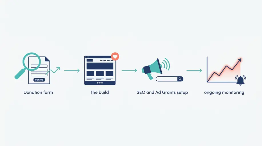
We confirm eligibility, structure campaigns around the real donor and support searches people are already making, and monitor performance so the free budget actually gets spent rather than quietly expiring each month. For a small charity, it is often the single largest piece of unclaimed marketing budget sitting on the table.
Beyond Donations, There’s a Second Audience Worth Serving Properly
Not every visitor to a charity website is there to give money. Plenty are searching for the actual support or service the charity provides, and treating this audience as an afterthought behind the donation messaging misses a genuine opportunity to help the people the charity exists for in the first place.
Content built specifically around service related searches, distinct from donor focused content, is the kind of work our content strategy service covers, and it tends to serve both audiences considerably better than trying to make one page do everything at once. A parent searching for support services shouldn’t have to wade through fundraising appeals to find the information they actually need.
Getting the Balance Right Across a Small Team
Charities rarely have the resource of a large marketing department, which makes efficiency in how a website is built and maintained genuinely important. Every hour spent fixing a slow donation form or chasing a security issue is an hour not spent on the actual mission the organisation exists to pursue.
That’s really the underlying argument for getting the fundamentals right early, a donation journey that converts properly, a secure and well maintained site, and content that genuinely serves both donors and service users. Get those three things solid, and a small charity team can spend far more of its limited time on the work that actually matters, rather than firefighting a website that was never quite built to support what the organisation was trying to achieve.